Which Cover Do You Like Best?

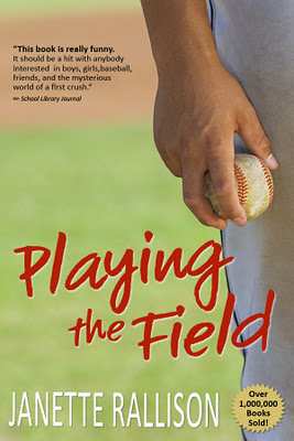
I put Playing the Field, one of my earlier books, up as an ebook last month. I needed a new cover and couldn’t decide whether to use one that would appeal to boys–because the main character is guy, or one that would appeal to girls–because most of my readers are girls. And, after all, a lot of girls read books with guys as main characters.
Then fellow writer, Robin Brande, suggested I do two covers and see which sells best. Which was a great suggestion and would have been a very interesting cover experiment. The only problem is that Amazon (and I suppose other sites as well) don’t let you put up two different covers for the same book. 
So, I’m going to ask you all which you like best. Does the boy cover appeal to you even though it’s clearly a boy cover, (The guy does have a sort of hot wrist, after all)or would you pass that one by and only buy the girl cover?
And, in case you really do feel like buying a good middle grade comedy, I’ve just lowered the price to .99 on Amazon and on Smashwords (which lowers it on B&N, right?)so you can also vote by buying one copy or the other.
Here’s the link to the girl cover:
http://www.smashwords.com/books/view/108937
Here’s the link to the guy cover:
http://www.amazon.com/Playing-The-Field-ebook/dp/B006HWV3KG/ref=sr_1_2?s=digital-text&ie=UTF8&qid=1326779906&sr=1-2
29 comments
Leave a comment
Subscribe and receive 3 free Ebooks!
Want to know about new releases or ebook sales?
Sign up for Janette's newsletter and receive a free copy of 3 books:
- Slayers
- A Longtime (and at one point illegal) Crush
- Blue Eyes and Other Teenage Hazards


I vote boy cover. It appeals to me even though I am a girl.
I like the girl cover. I’m sure it’s got a little romance and the girl cover suggests that. The boy cover makes me think that the target audience is male and if I were to read it, it would be very sporty.
Great self-pub’d covers!!
The guy wrist one wouldn’t get me to pick it up, though, but it does have pretty girl writing. Girl’s hand holding the ball? Heck yeah.
The second one has the guy’s stomach showing. That seems a little…playing for the other team, if you know what I mean. ;o)
-Susan
I like the boy cover better. It apeals to me (a girl!) more plus it’s not to girly for a boy to pass it by.
I like the boy cover best.
I like the girl cover best.
I think its more the colors and composition that appeal to me, rather than the fact that I’m a girl.
I like the brighter colors of the girl cover.
I dislike the super-long quote on the boy cover.
I didn’t even notice the “books sold” sticker on the boy cover until I looked for it after seeing the girl cover.
I like the uniform background of the girl cover.
I would have to go with girl cover. I probably wouldn’t even pick up the boy one to read the blurb.
I like the girl cover, but mostly because I think it would be more of a love story. The boy cover just seems like it would delve too much into the game for me … but, obviously from the comments it’s a close bet!
Hard choice. I love them both! The boy cover is amazing, but it looks like a more serious book. Since I’ve read the book I think the cover with the 2 teens smiling matches the theme better.
I like them both, but I’d probably choose the girl cover over the boy cover since the story is about so much more than just baseball.
(And having said that, I just bought the Kindle version from Amazon — with the boy cover! I’ve read the book but hadn’t had my own copy and can’t pass up $0.99 — especially when I have a son named McKay!)
A son named McKay, yep, you’ve got to own the book.
And I never even noticed that you can see a slice of the guy’s stomach on the girl cover.
You know how teachers are always telling you that you have to be observant to be a writer? Obviously not . . .
I think that the first one would be better. Even though as a girl I might say the second, overall the first one is better I think. Sierra
Keep Growing Beautiful♥ (Cause You Are!)
I would have to say the Girl Cover. It’s more…how you say it….eye catching. Brighter colors. And a better green shade. (that’s my geeky Green-loving side) But the first one, great cover, for me the second one a peals more. But I’d buy either since I’m sure the book is FABO!
First glance I thought I would pick the girl cover, but after thinking about it longer, I pick the boy one. Hmmm… That’s not very helpful, is it?
Girl cover for me. I don’t like sports enough to pick up the first, but I definitely love a good romance. Look forward to reading it.
The girl cover is much more appealing to me. It promises romance.
I haven’t been able to read that particularlly (so I don’t know what happens), but I like the guy cover best. From the title, I assume it has to do with baseball, and the way to get someone who likes to read about baseball stories, is show something to do with baseball. I also like the detail that the ball is dirty, like it’s been played with before & might be lucky, therefore the book being lucky or good. Guy completely.
GIRL COVER. The boy one will just make girls feel like they are reading a boy book. They say don’t judge a book by its cover but a ton of people do anyway. And the girl one is infinitely more appealing to your fanbase.
This is completely off topic but………….I finished a book!! Well short story actually, but still. Go to my blog (by pressing my icon pic) & check it out! Please. Not really anybody sees it, and there’s absolutely no comments or followers. I would really appreciate it. Thanks! I’m really excited.
I think that the second cover is neither a boy or a girl cover. It has a boy and a girl on it. So I would go with that one.
I like the boy cover best. I’ve read the book, and I think the boy cover represents the book itself better. The girls are likely to pick it up anyway, even with the more boy-ish cover, once they read the back 🙂
I would go with the second cover.
Um… here’s a vote from a guy… 🙂 girl cover. From my experience (as a male) there are certain book covers that a self respecting guy would not be caught dead exposing while he read them. We select books partially by how awkward it will be when our friends who are dudes ask us what we’re reading. But if it’s an e-book… nobody has to know, he’s reading it on a coverless e-reader! 🙂 Besides which, the ‘girl’ cover is more interesting and it feels like it nails the tone of the book better – therefore… a guy who is, in the first place, willing to read this sort of book shouldn’t mind too much.
Interesting point, Joseph. Covers on ebooks really only catch readers attention while they’re shopping. When a person is reading them, the cover disappears.
The guy cover’s better, even though I’m a girl. The boy’s one would catch my eye.
My vote: girl cover! I’ll admit it freely – I probably base 80% of whether or not I’ll even pick up a book just by the cover….I’d most likely pass it by otherwise.
I vote boy cover. It would attract more readers, since those of us who are familiar with your writing will pick it up anyway, and it will draw readers who are turned off by cheesy romantic covers (though they are fun 🙂 )
Initially I liked the cover with the girl and boy, but on a closer look, I think their clothes are too 80’s. What guy wears a polo shirt like that these days? I like the idea of this cover – it’s more eye catching to me. But hesitating over their clothes.
I would love to vote for cover. It is really attractive and appeals me a lot.