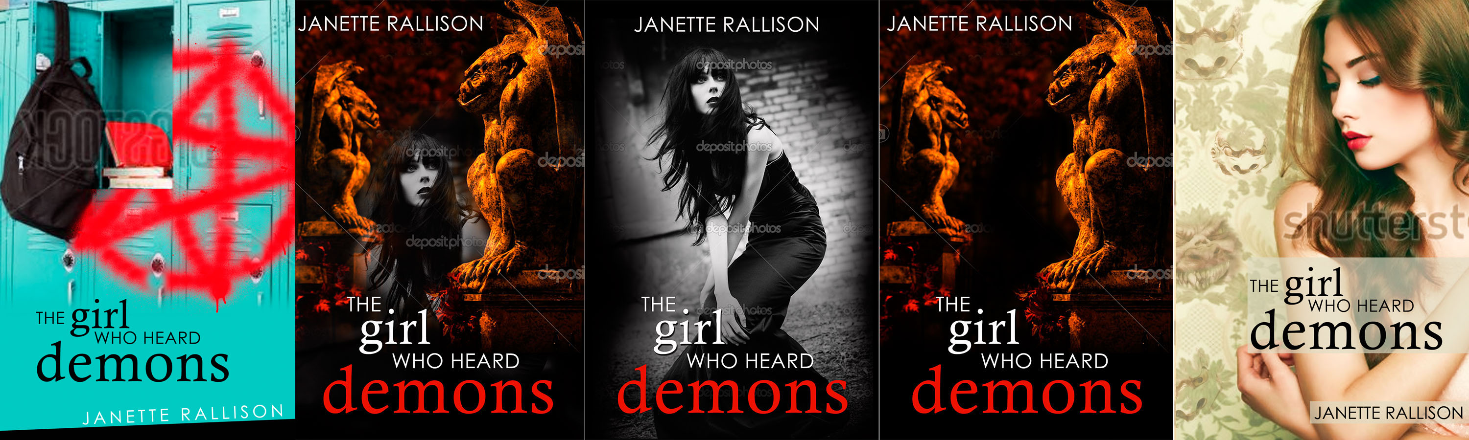
Demon Book cover take two
Su at Earthly Charms came up with some more covers for my consideration and of course I want to see what you think of them. Do you have a favorite? Thoughts? Do you get the last one?
13 comments
Leave a comment

Stay In The Loop
Subscribe and receive 3 free Ebooks!
Want to know about new releases or ebook sales?
Sign up for Janette's newsletter and receive a free copy of 3 books:
- Slayers
- A Longtime (and at one point illegal) Crush
- Blue Eyes and Other Teenage Hazards
I love 3 and the last one.
(Although if you use 3 you’ll have to write in a scen where she’s wearing a black dress and buffeted by satanic forces.) haha
I see you didn’t like Demon Tongue. 🙁 haha
when you said “do you get the last one” did you mean that the demons were coming out of the wall paper?
definitely creepy.
The last one is fairly subtle – I probably wouldn’t have gotten it if you hadn’t mentioned something. Plus, in a small thumbnail (like Kindle) people probably wouldn’t see those details.
Honestly, I liked the first set of covers better. With these ones, they seem very dark and twisted. While I know this book is darker than your others, if I saw these books on a shelf, I most likely would not pick them up, thinking they must have a lot of swearing, graphic violence, etc. in them. Of course, when it comes out, I’ll read it no matter the cover (because you wrote it – and I know your level of “dark” is not the same as many other paranormal books out there). But the first ones seemed to have a better balance of the darkness of the topic without it getting twisted. I’d think these books were more on the morbid side …
Also, they *look* more Indie than the previous ones to me.
Something strange is going on with your site. I’ve tried to comment a few times now, so if this is duplicated – sorry!
I agree with Tiana about the last. The ones in the middle do not appeal to me, but the first is very high school-ish. If that’s the setting of the book, that would probably make the most sense. The colours are appealing too. If not, m second choice is the fourth one.
Yeah those covers look super intense! Haha! Personally, I would go for #3 because your book has darker undertones. I really like the kinda haunting and suspenseful feel about it! That cover also fits your book title well. #5 is my second choice; it doesn’t look as creepy, and I think it’s pretty sneaky that the demons are in the wallpaper. I like book covers that make you think. As for the other covers, they look like they’d be some horror and DEATH, EXORCISTS, AND MORE DEATH -type books…but that’s just my opinion. 🙂
I think the first one is too satanic. Just looking at that cover gives me panic thinking of the nightmare that would result from satanism at a high school. I agree that the last one is too subtle and the girl looks undressed. The second is okay, but I still like the third cover from your first set much better.
The middle is the best of these because it is the least scary. The last one is too subtle. I dont like the first one at all. Your other set was better. But you might want them to try again. So excited for this book though.
I agree with the ladies above, the middle three are not my favorite. But I do love the last one!
If I didn’t know what kind of writer you were I would be scared by the obvious demon ones. I like the last one for it’s subtlety and I’d be more likely to pick it up and then say “Oh, there are demon faces coming out of the wallpaper” after I flipped through it.
I like the last one the best, for you. If you wanted to darken the back to pull in the darkness of the content I think that would work. The third is my second favorite.
I like the 2nd and the 5th best.
I really preferred the first set of covers. These are a lot darker and I would be less inclined to purchase a book that had the darker looking covers. Just my little ole opinion 🙂
I have a confession, I usually don’t spend too much time looking at a cover. I remember reading the Twilight series (have you heard of that?) and a few years later while donating the books to DI, I saw the cover and I said to myself, “Why is there an apple? Did I miss something?? I can’t remember an apple. It’s red. Does that mean blood…?” It was all very confusing.
So, why I am I wasting your time? I wanted to tell you that I like the 5th. Then, when I donate your book (ahem* just kidding, I will buy it on Kindle and have it forever), I will understand what it was about and laugh that I missed it on the first read.
IGNORE ABOVE…I like #5.
I like the 4th one best.