The Marketing Department Strikes Again
Not long ago the bow-tied one sent me some sample covers for When You Wish Upon a TV Star to see which one I liked best. Here they are:
I emailed him back that I really loved the one of the girl blowing on the dandelion. Isn’t that a great cover? Wouldn’t you pick that book up?
Honestly, sometimes I think they ask me what I like just to insure they don’t pick that one. It’s sort of like clothes shopping with my teenage children. They ask me which outfit I like best in order not to buy it–because hey, if their mom likes it, it obviously isn’t cool.
Here’s where they’re headed now. And I don’t mind them either . . . it’s just not the one I loved.
14 comments
Leave a comment
Subscribe and receive 3 free Ebooks!
Want to know about new releases or ebook sales?
Sign up for Janette's newsletter and receive a free copy of 3 books:
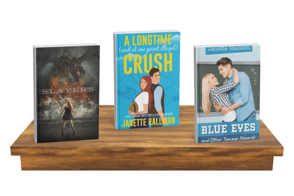
- Slayers
- A Longtime (and at one point illegal) Crush
- Blue Eyes and Other Teenage Hazards


I liked the covers with the dart and the dandelion. They’re all beautiful, but I don’t really like the one with the girls’ standing there, mainly because I’m more of an interesting design and graphic element than incorporating photos. But its still really good, and I would still pick it up.
The dandelion one was my favorite as well because it looks like a bright star. I don’t understand why they’d go with a genie lamp when the title is about a “star”–seems like they’re mixing metaphors. Also, the ones with the girls are visually boring.
I liked the one you liked and #3 of the new ones. Don’t like the girl ones either.
#3 of the new one is my favorite (orange cover).
Honestly, I’d pick it up just because it has your name on it. 🙂 Your books always make a bad day a good one. But I agree, I don’t really like the covers of the ones with the girl either.
Yes, the one with the dandelion is the best. But of the new choices, I’m with Heather. The orange one with the genie lamp. But, gosh, they just don’t convey the title like the dandelion. Now that you’ve caught onto their little game, next time you should tell them you like your very least favorite one. You know the game, tell them that in no way, shape or form you would ever consent to (insert your favorite cover here). That way, you’ll get what you want.
Oh man! I loved the girl blowing too! I wonder why they didn’t choose that one??? I like the ones with the lamps out of the ones left…sigh. Good luck!
I liked the dandelion one best too – at least the new ones with the lamp are improvements over the original – I like the ones without the girl standing there the best too. Wonder what marketing knows that we don’t?
the one with the girl with remote in hand just looks tacky. the genie one is ok, but, uh, hello marketing people, there’s no genie in the book.
i guess it’s the whole cover story thing (and I still like your covers more) all over again
I like the dandelion one too. But of the four remaining, I choose the yellow one. I like that best.
I would pick up your book anyway…no matter what the cover looked like. Your books are like my favorites!!! Scratch the like, the ARE my favorites!!!
When is this book coming out? I’m sooo excited to read it! I would buy it if it had any of those covers. They are all great. What is this book going to be about?
Agreed, I much prefer the dandelion. The others just aren’t the same. 🙁