weigh in on the cover . . .and the title, while you’re at it
So I ended up finishing the demon book instead of working on Slayers three. I know, I know, I wanted the third Slayers book too. More than you want it, I promise. But this book sort of wrote itself while the third Slayers was being hard and difficult and not telling me how it should start.
 (If you click on the photos, they grow larger.)
Here’s a brief synopsis of the book:
Adelle is your normal high school senior, who unfortunately sometimes hears demons taunting other people. In the past, she’s tried to help people counteract the demons’ influence, but as soon as anyone found out she heard voices, they thought she was crazy. They did things like spray paint pentagrams on her locker. She’s moved in with her aunt to get a fresh start and finish high school in peace.
The principal at her new school has his own demon entourage, and he doesn’t trust Adelle. When she hears demons talking about a guy’s impending death in a car accident, she knows she has to save his life. She does, and her secret is out.
And okay, I need to think up a better blurb–one that indicates the principal is a villain not to be trifled with. But you get the idea.
Girl+ hot guy+scary bad guy+demons= hopefully a book you’ll like.
If you can think up a snazzy title that also lets people know it’s not your average high school story, please let me know since I’m not married to: The Girl Who Heard Demons.
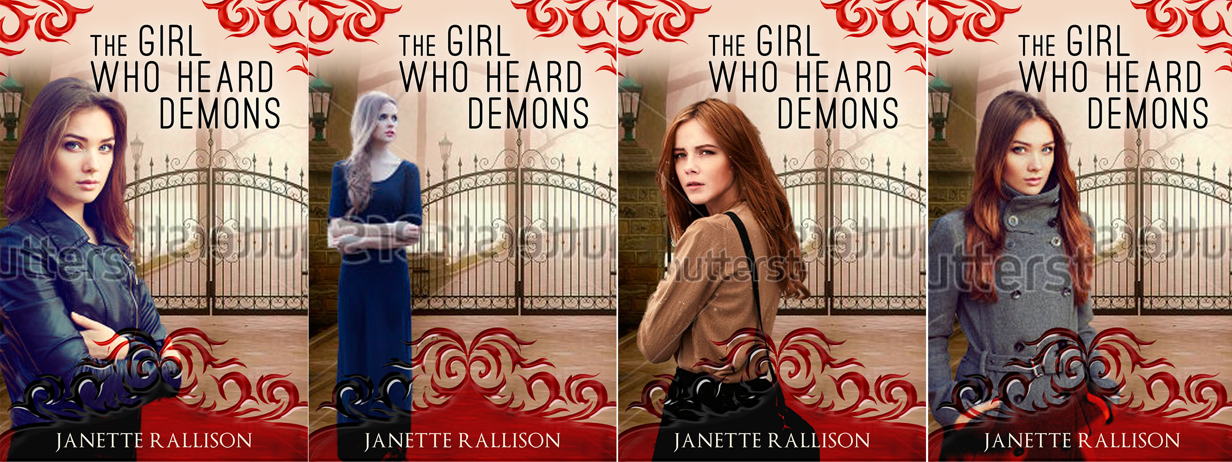
Su from Earthly Charms came up with these covers for me. I like the idea of a girl in front of the gates because I think it gives the book a darker feel. I don’t want people to think this is a high school comedy. A part of me worries that the cover is too busy and maybe I should go with a singular image.
I like these two model images . . .but I’m not sure what I would do with them. Mist maybe? Maybe the wallpaper could transform from flowers into demons? Suggestions?
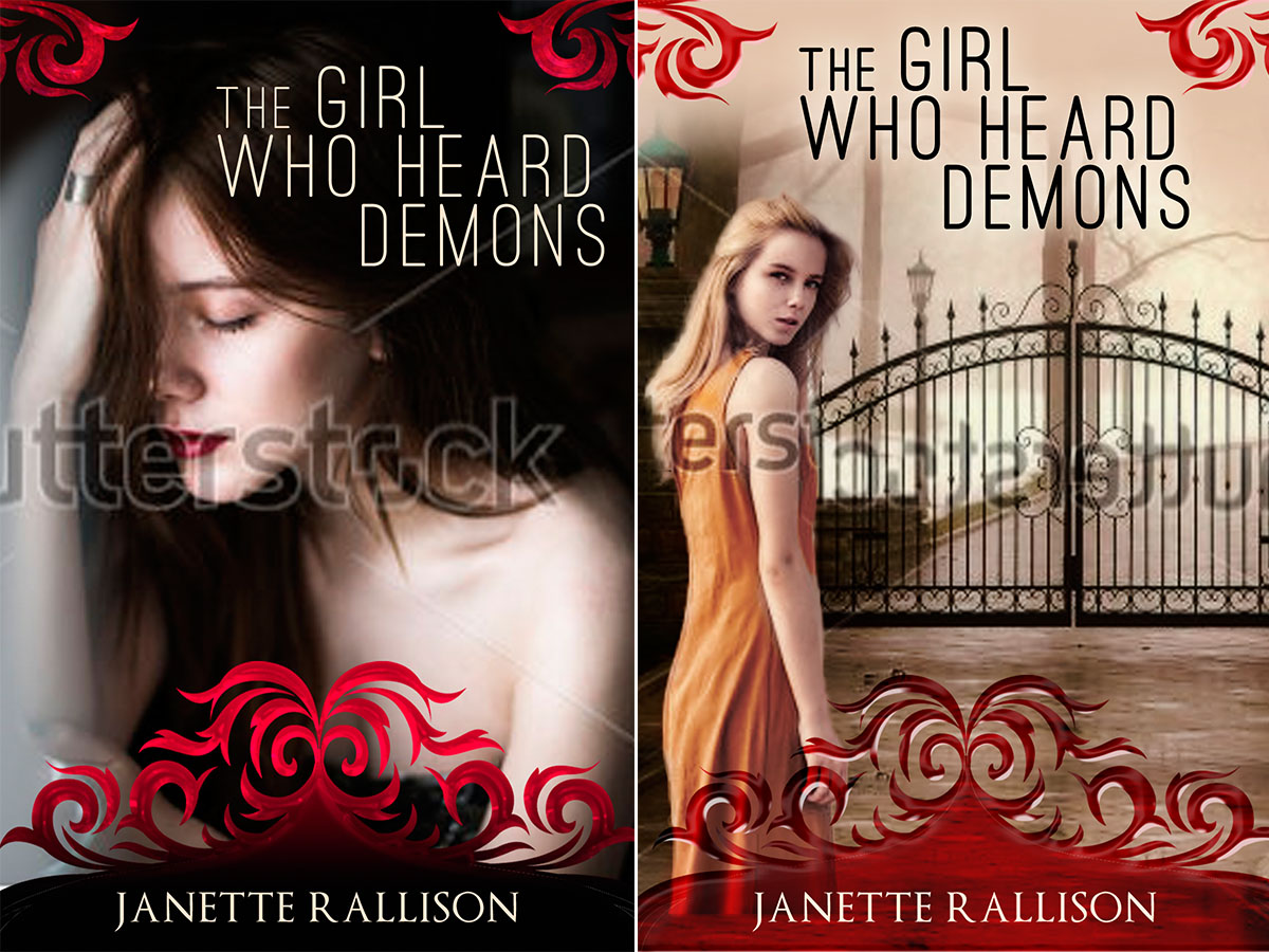
Su also did these mock ups for me and I liked the first but I thought it made the story look like she was dealing with inner demons. These demons are quite external. So all you creative people, let me know what you think.
38 comments
Leave a comment
Subscribe and receive 3 free Ebooks!
Want to know about new releases or ebook sales?
Sign up for Janette's newsletter and receive a free copy of 3 books:
- Slayers
- A Longtime (and at one point illegal) Crush
- Blue Eyes and Other Teenage Hazards


In the set of 4, I like first and third best. I don’t think they’re too busy. And I kind of like the title.
In the first set of four, I like the third.
Hi! I wrote a fanmail to you like, 3 years ago, oh my. Anyway. I think the title is cool but “the demons she heard/hears” sounds dope to me too. Or like “the demons outside” cos y’know, ‘the devil inside’. I’m joking about the latter, if you didn’t catch it. I like the thurd and fourth in the set of four but i was thinking maybe a picture of her clutching her ears…? (Just a suggestion, really). Anywho, i look forward to reading this!! (And slayers #3!!)
I like the 4th cover, but I would add the Principal on the other side of the gate with black mist around him. I’m not a fan of the title, maybe something about her being a heroine for those she helps?
Of the set of 4, I love the 1st and the 4th covers!
Yay! So excited you have a new book coming out! I like the title, the only other I could come up with is “Demon Kissed” but I have no idea if that would fit your mythology or not. 🙂
I like the idea of adding mist to the cover, would definitely make it more spooky. I like the girl in the first shutterstock photo. I also love the gates and the red in the covers. Of the four top covers, I think I like the first one the most.
I like the third of the top versions the best. The warmth of her brown top she is wearing makes her the focus of the image. The bag over her shoulder for some reason reminds me of high school (kind of an over the shoulder book bag feel). Also, she looks a little haunted and troubled, which matches your description better than the sassy/sultry looks on the other models’ faces. The bottom girl in brown kind of looks like she herself is possessed by demons and she’s getting ready to commit mayhem.
Btw, I like the title. It would entice me to pick up the book to learn more. Also, I see now that the bottom girl is really wearing orange … but she still looks like she is looking to make trouble.
sounds like a book Id like to read. I like the third cover the best but I’d make it darker… Misty maybe. Title is too straight forward. How about Demon whispers. Or Dark whispers. Or something short and cryptic. Can’t wait to read it!!
I like the girl in the leather jacket. It gives her an edge and makes her look like she’s ready for action, but it still has a modern high school feel to it. Putting her in a dress might make readers think it’s a long ago far away type of book.
Inner Demons
Outer Demons
Where Demons Lurk
Demon Whispers
Demon Speaker
“It’s Where My Demons Hide! It’s Where My Demons Hide!”
The Demons of Adelle Lastname
Demons Dreams
Demon Girl
Now if I could only get Imagine Dragons to blurb it . . .
In the set of four I like the second one because she looks as though something is out there and could appear at any moment also she looka a little scared. However I think you should use the clothes from the first one to match the books description. For the title how about Lurking Demons? Can’t wait to read, good luck!
Of the set of four, I like the first and third, with the third being my favorite. I don’t mind the fourth either, but I don’t like the second one at all. I like the title as is! If you’re looking for a few more suggestions, I also like:
Listening to Demons
Bargaining with Demons (If there’s any bargaining going on)
The Demons she Heard
As usual, I like the odd cover out that nobody else says they like. The second one in from the left, the blond girl staring off into the distance. I love the title The Girl who Heard Demons, because it fits the book perfectly. It also sounds like a best-selling book title. And if she’s hearing demons, I definitely want her looking anywhere but at me. I don’t have any demons, and I don’t want her telling me there are any standing behind me, either.
I like the ones where she is looking back over her shoulder best (and of those two I like the top one, which is the 3rd, that other ppl are voting for).
What about “Hearing Demons”? or “Dealing with Demons”
I like the 3rd one because she is looking over her shoulder and it looks more like she is a student. The title is clearer than some others suggested but Demon Whispers might be okay.
I like the third one. She looks real, not a model type, someone a young person can identify with. She also looks best for the title.
First of all, this book sounds awesome! Second, I’m not all that artistic, so I don’t know how much help I’ll be, but I really like the 1st cover in the grouping of 4 at the beginning! But I also like the 1st Shutterstock photo of the 2 in the middle. And maybe a little smoke would be fun? I don’t know, lol. But I cant wait to read it! 🙂
Speaking as a professional artist, and out of the first 4, I would go with either #1 or #4. However, I LOVE the images of the “two models,” (The girl in front of floral wallpaper and the other one.) I haven’t seen them commonly used on covers before, and I think they would make it stand out for you. I also love this idea: “Maybe the wallpaper could transform from flowers into demons?” Mist would be cool too, though. And love the title. Not loving the font, though. I think you need something that stands out better.
I like the first one at the top best.
You could call it “Voices”
Honestly, in the first set of 4, I only like the first one. The second looks like she’s about to break into song, the 3rd looks like she’s looking for the bathroom, and the last one looks like she’s trying not to laugh. I don’t really like any of the others either. No offense.
I DO like the model that’s sort of looking down with her arms crossed. It kind of looks like she has a secret, but also like she’s really tough about it. Like she doesn’t like that she hears demons and doesn’t want anyone to know, but she’s not about to let it get to her. That would be cool, with maybe some dark shadows turning into demon shapes.
Now, for titles…Personally, I like the title, but I can make some suggestions, too, if you don’t like it.
The Dark of Demons
Demon’s Ear
The Voices of Demons
Demon Whisperer
Demons Talk
Where Demons Hide (Thanks ID!)
These are all pretty lame, I think, but maybe something here will spark your genius and inspire a title.
Of the set of four, I like the third one best. The title is great, too.
I like the first and the fourth. I think that the coat really says something about the character.
My sister suggests the tile should be changed to The Girl Who Hears Demons”.
Maybe use the word “voice” and/or “risk”. What about, “What the Demons Told Her”?
Definitely the third. She looks haunted, but like she’s going to do something about it.
I’d lean toward something shorter for the title. Maybe “Hearing Demons” or “Demon Voices.” Can’t wait to read it!
I like #1 and #3 even better because she looks like she’s not really happy to be hearing demons. Great idea for a novel! Some ideas I liked: THE GIRL WHO HEARD DEMON WHISPERS or just DEMON WHISPERS or THE GIRL WHO HEARD EVIL (with the demon wallpaper) or THE GIRL WHO SHOULD IGNORE DEMONS VOICES, THE UNFORGIVABLE GIFT, EAVESDROPPING ON EVIL, THE DEMON DODGER, DEMON’S DASH: THE GIRL WHO HEARD TOO MUCH. Best to you!
On the top set, the third one is best! The girl’s coloring matches the color of the background better! I think though the bottom design on the book (the one that your name is written on) is a little too busy and distracting. But other than that, it looks very promising! 🙂
I like the third one with the girl in brown – with the haunted look over her shoulder. I like the idea suggested earlier of a dark personage in the background and mist. Of the other two you put up, I like the second one – where her hair is kind of flying all over the place. I look forward to reading the finished product!
I like the third best, I think because of the emotion on her face making me feel most connected to her and to the story. The second, with the girl looking off to the side, I sort of react to as though she is disconnected from what’s going on for some reason. The first and very last pictures are okay.
My daughter and I both think that the second cover in the set of four is the best one. I like it because the model is looking off camera in a way that makes me think she is listening to something.
I like one and three, but three the best. Four is fine, but I don’t like two at all. As for the models, I feel like they need some clothes, otherwise they are fine. I like the title fine, but thought “Hearing Demons” might be a little more succinct. “Demon Whispers” or “Dark Whispers” sound good as well. Also, as a play off another suggestion, “The Haunting of Adelle Lastname”.
And I’m married to a school principal, so I hope your villain is nothing like my husband. 🙂
For your sake, I hope your husband is nothing like my character too!
I would pick up a book with the 3rd cover first and then the 1st cover next
I really like your very last cover. The blonde in the orange-ish dress. I love the shadowed light and trees behind the gate. Maybe a creepy demon shadow could be behind the gate too? I love all your books! I can’t wait!
title options – (hidden voices) or (the world unseen)
also the second piture from the first set of four – blonde looking off in distance
Love the very first one of the set of 4. She looks self assured
I know I’m way late to this conversation and you’ve probably already chosen the cover (#4!), but I just wanted to say that I LOVE the main character’s name in this book (which I will most assuredly purchase and not just for the character’s name). I named my only daughter Adelle and I’ve never met anyone who spelled it with two “L’s”. And THAT’S just another reason why you’re my favorite author.
That’s all I had to say. I’ll go back to lurking now. Carry on. Carry on.