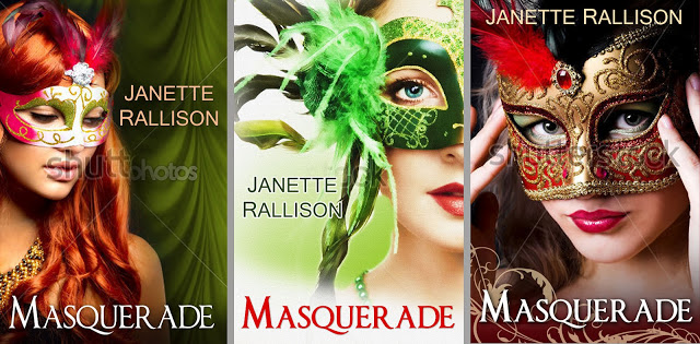
Which cover do you like best?
I know I said I was going to do another–what the kids were doing while I revised blog–but then I got these lovely cover proofs from Earthly Charms for the ebook cover of Masquerade–which I’m in the process of rewriting for the national market. Hopefully it will be released in a month or two (depending on how much time I have since Putnam and Feiwel will both send revisions to me on other novels soon).
So which cover do you think works for a romantic comedy? Also, let me know if you actually like to read romances. (One of the interesting things I’ve found is that people who don’t like to read romances prefer the middle cover. But the thing is–if they like it because it doesn’t seem ‘romancy’ then maybe it’s not the best cover since romance readers are my target audience.) So yeah, let me know if you actually read romances.
Thanks!
51 comments
Leave a comment
Stay In The Loop
Subscribe and receive 3 free Ebooks!
Want to know about new releases or ebook sales?
Sign up for Janette's newsletter and receive a free copy of 3 books:
- Slayers
- A Longtime (and at one point illegal) Crush
- Blue Eyes and Other Teenage Hazards


I like the middle one best, and I do read romances, but I don’t always want people to know that I’m reading a romance, so… But I actually think I like the middle one best because I don’t much like the color red and I really like the greens in the middle. And green + white feels very clean and fresh to me, if that makes any sense.
And the other covers are a bit more red-dominant, I should say. I don’t mind it in small quantities.
The middle one best. The green is gorgeous! I like romances. Well, most of them.
And if I had a second choice it would be the third one.
The last one! It’s so pretty, and there ISN’T too much red.
I prefer the middle one too. I think red is a bit passé when it comes to romantic book covers. Though I really like the last one too.
I love the last one. And yes, I do read romances.
I like the third one the best, but it looks similar to many other books out there, so I would go with the middle because the green really makes it stand out. I like YA romances and romantic suspense.
The middle one has the best coloring and is very lovely. If you could change the lipstick color on the last one it would also be very lovely. (Maybe it is my computer but that pinkish color is totally in disharmony with the other colors. It makes the color of her lips vs. lower mask the focal point of the picture – for me. To judge a book by its cover I wouldn’t pick it up because of that. But, I would pick it up if it had your name on it 🙂 I love romances and I love your books!
I read some romances… sometimes. So I’m in the middle I guess. I really like the third one because it’s gorgeous! My second choice would be the green one. I think for a romantic comedy aim it would work better, but the third one would also work for romantic. Just not so sure about the comedy part. Sierra
Keep growing beautiful!
Wow, they are all so beautiful! I like the third one best I think, but the second one is really close too. I read clean romances, but not the steamy sexy stuff 🙂
I also prefer the one in the middle. And I love reading romances! I would rather take this cover because it seems more mysterious and together with the green colour it just looks amazing! If it would be standing this way in a bookshelf, I definetly would buy it 😉
I love the middle one! Like Marissa I like to read romances but don’t always like people to know that. 😉 The middle one is a good cover. (see what I did there?)
The end one and of course I read romances! 🙂
They are gorgeous! I like the middle one the best – if any of them even hint at comedy I would say that one, but most of them say “mysterious” to me. I read books with romance in them, but I don’t think I read the romance genre, if that’s what you mean.
None of them really scream romantic COMEDY to me. They all seem drama-ish. I like the last one best, but it reminds me of another cover that’s out right now – um, VENOM by Fiona Paul. It’s almost identical. So, I’d say the green one.
I agree with several other commenters that said none of these really seem to fit the comedy genre. But with that said, I like the third one the best. The second and third one have models with upraised eyes, which maybe doesn’t say “comedy” but does lessen the drama of the covers a little bit. I like the colors in the third one best. Plus the model looks a little Anne Hathaway-ish to me! 😀 I read YA romances sometimes, and books of other genres that have some romance in them. And by the way, these covers don’t really say “romance” to me either. They say “drama.” But anyone who knows your writing will know that romance and comedy are always going to make a showing.
They are ALL BEAUTIFUL!!!!!!!!!!!!!
Sheesh. I can see why you are having a hard time. When I first clicked on link, my eyes went straight to the 3rd one. I think the mask and color stands out most.
But the second is so awesome too. And the first. Although the first reminds me more or an avatar pic or poster. It’s between # 2 and #3.
LOVE them all!!!!
I’d vote for the third one. It looks the most cohesive.
LOVE the 3rd one! But I also like the second one with the green theme since I love green!
Middle!
i like the third one. red is more of a romance colour. but the green is more refreshing and simpler.
i like the middle one best and ya im not a romance reader haha
Definitely the green. I have read and own Masquerade and love it! One of my favorites! I obviously do read romance – clean, which makes yours perfect.
Wow. I guess I’m the odd ball here. I like the first one the best! Hahaha
Haha I was looking at the covers first and thought, “I like the middle one the most,” then I read the actual blog post and saw that you said “One of the interesting things I’ve found is that people who don’t like to read romances prefer the middle cover.” And I don’t usually read romances! I thought that was funny 🙂 So there’s my choice 🙂
Left a comment on Goodreads, but I had an addendum… So I think the middle one says “comedy” more than the other two, but it doesn’t say “romance” very much to me. The first one also catches some of that “comedy” feeling with the little bits of bright colors mixed in. The first and last ones say “romance” more than the middle… so the best of both worlds would be the first one since it strongly says “romance” and also says “comedy”.
At first I really liked the middle one, but as I kept looking the first one won. I like the green background with her hair (the watermark is a bit distracting though). I like romances, but only the clean ones.
I think the middle one is best; the first and third covers look rather “sultry” to me, which doesn’t really match the Romantic Comedy genre. I do read romances, but only clean ones . . . and I prefer them to be humorous (which is probably why I enjoy your writing so much).
I love reading romance novels. I really like the middle one because I really like the mask, and the colors just seem to go together better. I also like the contrast between her red lips and the green mask.
2nd one best. The others look more like romance novels.
i love the last on the best. my second choice is the first one
I like the third one the best and I read romance. The girl’s eyes give a lot of expression and her head is tilted in a flirtatious manner. It’s very grabbing and intriguing.
You should definitely go with the middle one. The others look way too much like other books that are out there right now. Plus the green will make it stand out. Anyways, I am definitely a romance reader. Cant wait for the book!
This comment has been removed by the author.
The far right one, definitely. I do read romances (I have no love life of my own, so until I acquire a boyfriend, I’m living vicariously through fiction), and I actually own Masquerade (from when it was first published) and I absolutely love it! 🙂
I like the first one most and I do read clean romances!
Yay! I loved the original Masquerade, I’m excited to read this revised version!! I’m leaning for the third one (maybe minus the hands), I’m a sucker for red. They are all pretty though and admit, the second one seems a little more on the romantic comedy side… And yes, I read a LOT of romances. 😉
Are you going to republish What the Doctor Ordered and Trial of the Heart as well?? (Please say yes, I loved those ones too!)
THIRD THIRD THIRD.
Last one. Definitely. I feel it gives it intrigue and her almost smile makes you want to know more. The colors are amazing and I think your name is better placed on that one.
the middle one is the best
I don’t read romances very often, but the middle cover grabs my attention. The red one on the right looks exactly like another book I’ve seen recently.
I definitely love the green cover! It’s soooo much better then the others! The others just seem a little…. tacky, almost.
I read romances quite often (I assume we mean YA romance, not erotica?) and I love the green cover. The other two are not very original, and I feel like my gaze would simply pass over them.
I love the last one with the girl with the red feather. Why? Because it just makes her look mysterious and desirable. And just awesome. Masquerades are supposed to make you look like that and I think the other two don’t hide her face enough.
And I never ever ever read (or if I do, I never enjoy…) anything but romances. Definitely not the raunchy ones where they do IT on every page. But the cute, clean ones. Your books are the perfect example of what I’m talking about, except there are some where just a tiny tiny tad more SPICE would be great. Which is why I love you and your books.
I love the middle one best, because it makes me feel great just looking at it! I love the colors green and blue, and the way her eyes match the rest of the cover make me want to read a book with that cover most. I read clean romance, and am always asking if others have any suggestions for me. I know I can trust your books, Janette, because your writing is great, and not a single one of your books have anything nasty. Heck yeah, I read romance!
I think that the first cover would be a bit more attractive if the shading was a little lower, to make the whole cover a bit darker, except for her hair and her mask.
The third cover would appeal to me more if you – yeah I agree with Anna – change the lipstick. Make it a bit more redish/orange. I also think that her hair should be full out black. The mask is really pretty on the last one, and it stands out well in a good way. But yeah, my first choice is totally the middle one. If the other ones were changed a bit, I might go for them first, but yeah.
I can’t wait to read it! And I’m sure I’ll love it! -Anonymous
I like the middle one. Maybe it’s the green? Or how the girl is looking full on, confident?
I like good, clean romances so that means I like your romances, Janette! Good luck on revisions.
I read romances. I like the one on the right the best. The middle one is a close second. I think (despite liking the one on the rit the best) the two on the outside make it look like historical romance, not a romantic comedy. So excited to see this retooled!
I like the green one. The mask seems to be the best fit for that face. The first cover…mask too small, lips too large
third cover, although pretty and ornate, and intriguing, the is a HUGE mask!
Green is pretty. And who doesn’t love a good romance!
Having read this book, I’m not seeing the redhead, since wasn’t she a blond? So, middle?
I think I like the middle one the best too–as someone else said, the green is very refreshing.
Her eyes are also somewhat entrancing.
I choose the middle one because it looks the classiest which to me is both romantic and witty. It looks more professional and just works perfectly. The eyes are the focal point but the lips are playful and seductive. To me it is elegant and is exactly what you would want for a romantic comedy. I read romances!! And think the middle one is intriguing and unique and eye catching!